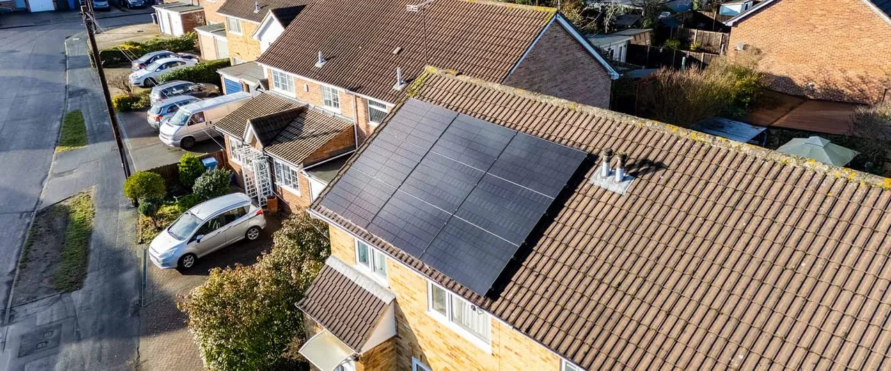
If you’ve had solar panels fitted in the last few years, there’s a good chance you’ve got an app on your phone that shows you how much they’re generating. Most people glance at it a couple of times in the first month, feel pleased with the sunny-day numbers, and then never open it again. That’s a shame, because the monitoring app is one of the most useful diagnostic tools you own — and a five-minute check once a week is often the only thing standing between “small fault caught early” and “six months of lost generation you didn’t notice.”
This post looks at what the four monitoring platforms you’re most likely to encounter — GivEnergy, Tesla, SolarEdge and Enphase — actually show you, how they differ, and what a sensible weekly habit looks like.
Why monitoring matters more than people think
A solar panel system has no moving parts and very few things that can go wrong quickly. That’s exactly the problem: faults tend to be slow and quiet rather than sudden and obvious. A failing string, a tripped isolator, a shaded panel from a tree that’s grown six inches since last spring, an inverter stuck in a fault state after a power cut — none of these will make a noise or send you a text unless the monitoring system is set up to tell you.
Ofgem’s price cap currently puts typical import electricity at around 25p/kWh, and Smart Export Guarantee rates from most suppliers sit somewhere in the 12–20p/kWh range at the top end (rates vary supplier to supplier, so it’s always worth checking your own tariff). Every kWh your system fails to generate because of an undetected fault is a kWh you’re buying back at import price instead of using for free or exporting for a credit. On a typical 4kW home system generating somewhere in the region of 3,400–4,200 kWh a year (UK yields average roughly 850 kWh per kWp, higher in the sunny south), a month of reduced output from a stuck fault can be a genuinely material chunk of your annual saving — and most people only find out at the next electricity bill, weeks after the fault started.
What each app actually shows you
GivEnergy
GivEnergy’s app is popular with UK installers because the company sells inverters and batteries as a package and the software reflects that — it’s built around showing the whole home energy picture rather than just the panels. You get:
- Live power flow: solar generation, battery charge/discharge, grid import/export and home consumption, all on one animated diagram
- Historical charts by day, week, month and year
- Battery state of charge and charge/discharge scheduling (useful if you’re on a time-of-use tariff and charging the battery from cheap overnight rates)
- Fault and alert notifications pushed to the app when the inverter reports an error code
Because GivEnergy batteries are AC-coupled retrofit-friendly kit, a lot of installers use the app to demonstrate real-time battery behaviour to customers who are adding storage to an existing solar array. If you’re weighing up whether a battery is worth adding to your existing panels, this is the kind of live view that makes the case tangible rather than theoretical.
Tesla app (Powerwall)
If you’ve got a Tesla Powerwall — commonly the 13.5kWh Powerwall 3, typically £8,500–£10,500 installed — you’re monitoring through the Tesla app rather than a separate solar-specific tool. It’s clean and consumer-friendly, showing:
- A simple flow diagram: solar, home, grid, Powerwall
- Storm Watch (pre-emptively charges the battery ahead of forecast grid instability)
- Backup reserve percentage — how much of the battery is ring-fenced for outages
- Self-powered vs time-based control modes
The Tesla app is the least “technical” of the four in terms of raw data depth — you won’t get panel-level diagnostics if you’ve got third-party panels paired with a Powerwall — but for whole-home energy behaviour and outage resilience it’s straightforward and reliable. Worth noting: if your solar inverter is a separate brand, you’ll likely need two apps rather than one, which is exactly the kind of setup where a weekly monitoring habit across both matters.
SolarEdge
SolarEdge uses power optimisers on every panel, which means its monitoring platform (SolarEdge app plus the fuller mySolarEdge web portal) can show you panel-level performance rather than just a whole-string or whole-system figure. This is the single biggest practical advantage for fault-finding:
- Per-panel output on a layout map of your actual roof
- Instant visual flag on the panel-level map if one specific panel is underperforming (shading, a loose connector, a fault on that optimiser)
- Historical performance charts down to individual panel level
- System alerts by email when generation drops below expected thresholds
If you’ve got a roof with any partial shading — a chimney, a neighbouring tree, a dormer window — panel-level monitoring is genuinely valuable, because it tells you which specific panel to check rather than leaving you guessing across a 12- or 16-panel array.
Enphase
Enphase takes a different technical approach (microinverters on every panel rather than a single string inverter), and its Enlighten app/portal gives a similar panel-level view to SolarEdge:
- Per-microinverter monitoring, so a fault shows up as one red panel on the roof layout rather than an ambiguous system-wide dip
- Very granular historical data, often down to 5-minute or 15-minute intervals
- Automatic fault detection and email/app alerts when a microinverter reports an issue
- Battery monitoring if you’ve got Enphase IQ batteries alongside the panels
Because each panel has its own microinverter, a single failed unit only affects that one panel’s output rather than dragging down an entire string — and the app makes it obvious which one needs attention.
Why weekly checks catch faults that monthly bills don’t
The common thread across all four platforms is that they can only help you if you actually open them. Here’s a simple weekly routine that catches the faults that matter:
- Compare against your own baseline, not someone else’s. Your system’s expected output changes with the seasons — a bright March day and a bright July day are not directly comparable. Most apps let you compare the same week last month or last year, which is a more useful sanity check than an absolute number.
- Look for a flat line, not just a low number. A system generating less than expected on a cloudy day is normal. A system generating close to zero on a clear day, or a chart that goes flat mid-morning and stays flat, is a fault — inverter shutdown, tripped isolator, or a communication fault between the inverter and the monitoring gateway.
- Check for the red flag on panel-level systems. If you’re on SolarEdge or Enphase, a single red or greyed-out panel on the layout map is the clearest fault signal you’ll get — investigate that panel specifically rather than the whole array.
- Don’t ignore “no data” as a benign glitch. A gap in monitoring data usually means the gateway has lost Wi‑Fi or the inverter has stopped communicating — not necessarily that generation has stopped, but worth a quick check that the router hasn’t been reset or the signal hasn’t dropped.
- Set up push alerts if the app offers them, and treat a fault alert as a “check this week” item, not a “check this year” item. Most installers can diagnose a fault remotely from an alert code in minutes if you call promptly, rather than having to schedule an on-site visit for something that turns out to be a reset isolator switch.
Inverter lifespan and why monitoring buys you time
String inverters (the type used with SolarEdge, GivEnergy and most non-microinverter systems) typically last 10–15 years before needing replacement, at a cost of roughly £500–£1,000 depending on system size. Panels themselves are far more durable — modern N-type panels (TOPCon, HJT or ABC cell technology) degrade at around 0.4% a year and are commonly warrantied for 25–30 years or more. Because the panels will comfortably outlast at least one inverter over the system’s lifetime, monitoring is what tells you when that replacement is actually due, rather than leaving you to spot it only when the whole system stops working.
If your app shows a genuine fault
A confirmed drop in generation that isn’t explained by weather is worth acting on quickly rather than waiting to see if it resolves itself. If you’re in South Yorkshire, ElectriFusion Solutions in Doncaster can usually diagnose an inverter fault code over the phone before booking a visit, and clients across the Midlands have had similar quick turnarounds from the team at Midland Solar in Birmingham. If you’re further south, Solent Solar covers Hampshire households with existing systems as well as new installs, and FLD Electrical does the same across Swansea and South Wales. For anyone who wants ongoing professional oversight rather than DIY app-watching, Solar Maintenance Solutions specialises purely in solar operations and maintenance nationally — worth a look if you’d rather a specialist caught the faults for you.
Monitoring isn’t just a residential habit, either. Commercial systems have far more to lose from an undetected fault simply because of scale — a business rooftop array generating for a school, warehouse or care home can lose hundreds of pounds a month if a fault goes unnoticed, which is why sites like Solar Panels for Schools and Solar Panels for Care Homes put ongoing performance monitoring at the centre of their guidance for facilities managers, not just the installation itself. If you manage a larger portfolio of sites, Commercial Solar Panels Installation is a useful starting point for understanding what a proper commercial monitoring and maintenance contract should include.
The bottom line
None of the four platforms is objectively “best” in isolation — which one you’re using is mostly decided by which inverter or battery brand your installer fitted, not a separate choice you make afterwards. SolarEdge and Enphase give you panel-level detail that’s genuinely useful on shaded or complex roofs. GivEnergy and Tesla give you a clearer whole-home energy picture, which matters more if you’ve got a battery and are trying to manage import/export timing. What matters far more than which app you have is whether you actually open it. A five-minute check once a week, comparing this week to the same week last month, will catch the vast majority of faults within days rather than months — and if you want a fuller sense of what your system should be earning you at today’s prices, our solar panel payback period guide and the wider do solar panels actually work in the UK piece are worth reading alongside your app data, not instead of it.
Set a recurring reminder, pick one day a week, and treat the app the same way you’d treat a smoke alarm — mostly silent, but worth checking rather than assuming it’s fine.